

Typography is an often-overlooked but incredibly important aspect of design. It's the art of arranging type to make written language legible, readable, and visually appealing when displayed. Whether you're designing a poster, a website, or a business card, the font you choose can make a big difference in how your content is perceived.
Why is font important?
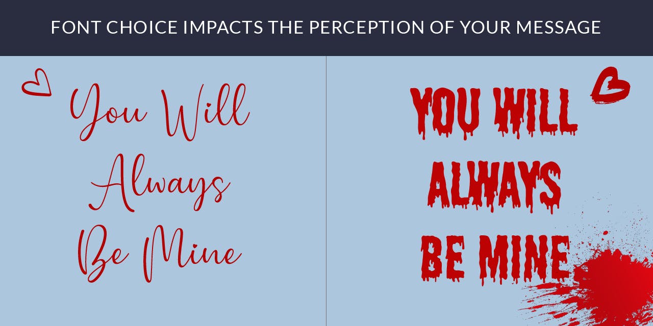
Font is crucial because it plays a significant role in how your content is perceived. The right font can help to set the tone and establish the personality of your brand, while the wrong font can make your content difficult to read and understand. Understanding the effect of font on readability is especially important for long blocks of text. If the font is too small or the letters are too close together, it can be hard for readers to distinguish one letter from the next, causing eyestrain and frustration. On the other hand, if the font is too large or the letters are too far apart, it can make the text look disjointed and disrupt the flow of the content. In addition to readability, font can also influence how professional and trustworthy your content appears. A clean, well-designed font can make your content look polished and professional, while a poorly designed or inappropriate font can make your content look unprofessional and untrustworthy.
Types/Categories of Fonts
When it comes to choosing a font, it's important to understand the different types and categories available. There are four main categories of fonts: serif, sans-serif, handwriting, and display.
Serif Fonts
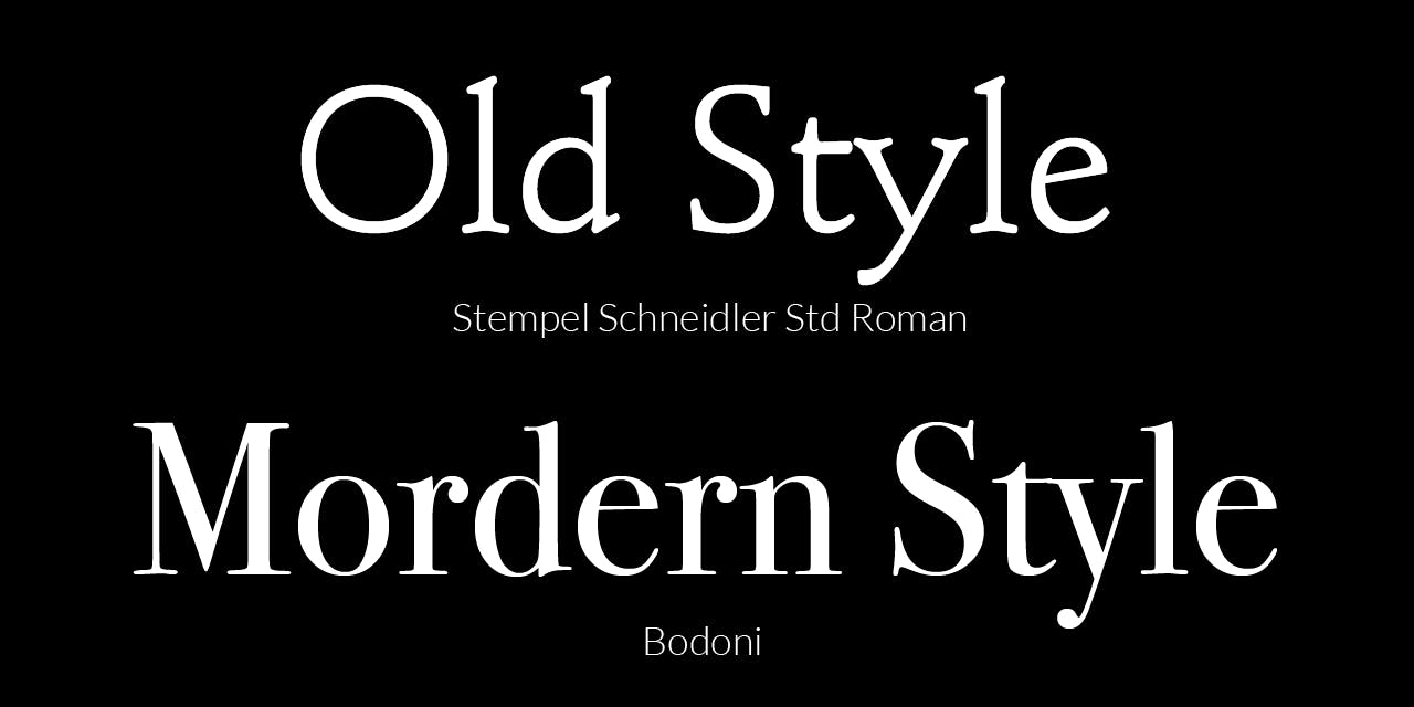
Serif fonts have small lines or strokes at the ends of the letters, which gives them a more traditional feel. Examples of serif fonts include Times New Roman, Georgia, and Bodoni. Serif fonts can be further divided into two main classifications: Old Style and Modern Style. Old Style serif fonts have a lower contrast between thick and thin strokes, have a more organic and flowing design and are considered to be more readable and easy on the eyes, typically used for body text in long documents. Modern serif typefaces, have a higher contrast between thick and thin strokes, and a more geometric, structured forms, they are considered more formal and traditional and are often used for headlines or titles in books, magazines, newspapers and other forms of design.
Sans-Serif Fonts
Sans-serif fonts do not have these small lines or “serifs”, giving them a more modern and minimalist appearance. Examples of sans-serif fonts include Montserrat, Lato, Arial and Helvetica.
Handwriting fonts
Handwriting fonts mimic the style of handwritten text and can be used to add a personal touch to your design. Examples of handwriting fonts include Comic Sans and Marker Felt.
Display fonts
Display fonts are decorative fonts that are typically used in headlines or logos. They are not suitable for long blocks of text because they can be difficult to read. Examples of display fonts include Broadway and Papyrus.
How to Choose the right font
Choosing the right font for your project can be a daunting task, with so many options available. However, by considering a few key factors, you can narrow down your choices and find the perfect font for your project.
Tone: The font you choose should match the tone of your project. If you're working on a formal business letter, a traditional, serif font would be more appropriate, while a more casual, sans-serif font might be better for a website or a social media post.
Readability: The font you choose should be easy to read, especially for long blocks of text. Sans-serif fonts are generally considered more readable, but it's important to test out a few options to see what works best for your project.
Formality: Different fonts convey different levels of formality. Serif fonts tend to feel more traditional and formal, while sans-serif fonts tend to feel more modern and casual.
Style: There are many different font categories to choose from, including serif, sans-serif, handwriting, and display. Serif fonts have small lines or strokes at the ends of the letters, while sans-serif fonts do not. Handwriting fonts mimic the style of handwriting, and can be used to add a personal touch to your design. Display fonts are decorative fonts, typically used in headlines or logos.
Old school vs Modern font types
When it comes to choosing between old school and modern fonts, it's important to keep in mind the context and tone of your project.
Old school fonts, also known as traditional or vintage fonts, are timeless and often have a classic, elegant feel. These fonts are inspired by traditional printing techniques and are well suited for formal or conservative projects like business documents, formal invitations, and book covers. Examples of old school fonts include Times New Roman, Garamond, and Baskerville.
Modern fonts, on the other hand, are more contemporary and have a clean, minimalist aesthetic. These fonts are often more versatile, and can range from simple and elegant to more experimental and decorative. They can be a great fit for projects that need a more modern and casual look like websites, social media graphics, and app designs. Examples of modern fonts include Montserrat, Lato, and Open Sans.
Ultimately, the choice between old school and modern fonts should be based on the specific needs of your project and the message you want to convey. It's always a good idea to experiment with different font options to see what works best for you.
In conclusion, typography and font selection play a vital role in any design project. The right font can help establish the tone and personality of your brand, while the wrong font can make your content difficult to read and understand. Understanding the effect of font on readability, formality, and style is crucial when selecting the right font. Whether you're choosing between old school and modern fonts, or between the different categories of fonts, it's important to consider the context and the message you want to convey. With a little bit of thought and experimentation, you can find the perfect font that will elevate your design and make your content stand out. Remember to always keep readability in mind, and don’t be afraid to try different options, as it's often the small details that can make the biggest difference in a project.